Take your generative QR codes to the next level with ComfyUI
stable-diffusioncomfyuiqr-codecontrolnetcustom-nodesinpaintinggenerative-ai
When the 1.0 models for Stable Diffusion XL were first dropped, the open source project ComfyUI saw an increase in popularity as one of the first front-end interfaces to handle the new model architecture.
In the following weeks, the already quickly growing project from 2023 had surpassed 10,000 Github stars.
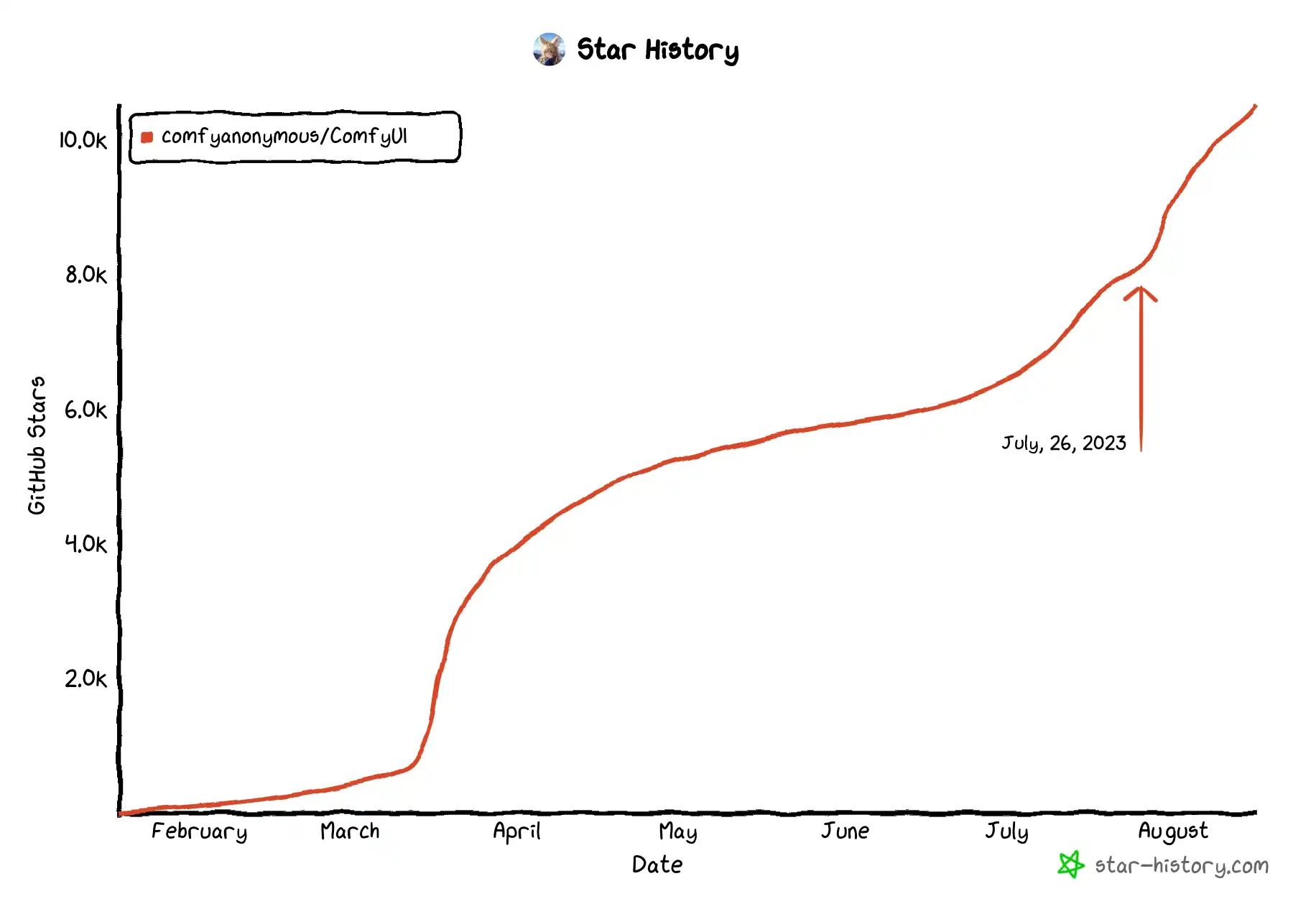
While other Stable Diffusion user interfaces quickly followed suit in the days following the SDXL release, the unique node based workflow resonated with many AI artists who wanted greater control of their creative process. Not only could complex workflows could be built in a modular fashion like lego blocks, but also developing custom nodes to extend the possibilities can be done in a just a few lines of Python code.
The introduction of QR codes to generative AI
In early June, the Stable Diffusion subreddit was abuzz with a novel application of its ControlNet neural network framework. The original QR models were never released, but within just one month, the open-source community had reproduced the idea.
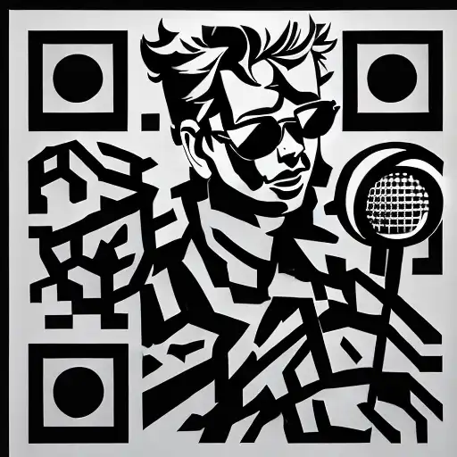
As of September 2023, generative QR codes have not quite yet taken over the internet. First of all, there aren’t too many open QR code specific ControlNet models easily found. Moreover, a general lack of good documentation on creating QR art along with unexpected friction in the process creates additional barriers. More often than not, when browsing through user contributions, it seems like most tend to give up before even getting their renders to scan.
The following text contains strategies and tools to be more effective at generating AI assisted QR codes. I’ve discovered these after taking a deep dive with ComfyUI and refining my own techniques and even include one or two open source custom nodes that I’ve coded myself.
Before I begin, in case you are wondering, the ControlNet model that I use for all of my example images is QR Code Monster which is currently just available for Stable Diffusion 1.5 (although discussion forums suggest that an XL model is in the works).
Regardless of the model you choose, be sure to carefully read any documentation it has. It could save a lot of frustration later. QR codes can be set to any resolution which on a low level would make it difficult for a ControlNet model to efficiently generalize across. An improperly formatted QR could render even the best model entirely useless.
Strategy 1 — Choose a subject carefully:
Some things are much easier to translate to a QR code than others.
If you believe there is one optimal weight for a given QR code ControlNet model, you would be greatly mistaken. Some prompts have had me chasing hours upon hours of iterative QR error inpainting (only to be discarded entirely later). More rarely, it’s possible to get “lucky” and require a concept that is perfect for the prerequisite chaotic mix of contrasting elements.
Take for instance the example below.
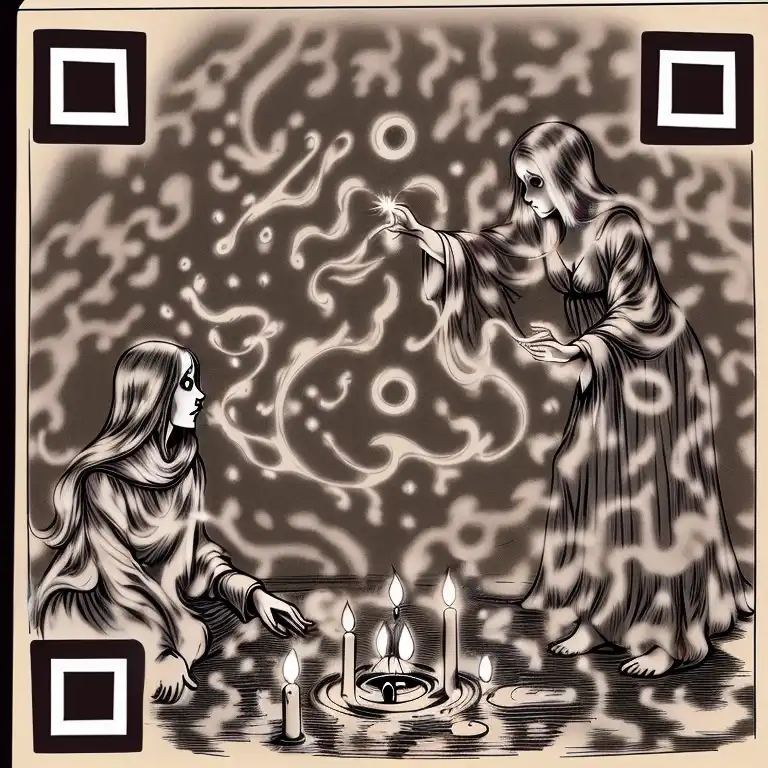
The inclusion of the words “wispy” and “ethereal” on a seance-themed QR code (for this “Medium” article of course), created options that were both scannable and visually appealing which can often be hard to achieve on a first pass. Apart from the obvious finder patterns, this QR code barely resembles its original form even though the color is almost entirely tinted away.
Generally, you will have much better luck with highly disordered concepts. For example, nature and outdoor landscapes are often good options, but including close-ups of people’s faces can present some challenges.
Strategy 2 — Isolate the finder patterns:
The finder patterns are the three large squares positioned around every corner (except the bottom right) and are present in every QR code. They are arguably the most important component that can make or break scannability.
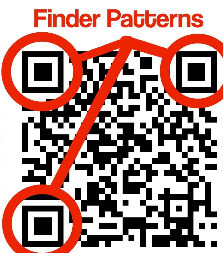
They take the form of an outer square, a gap, and an inner square (circles may also work). These components are the essential elements that signal to QR code scanners that there’s information worth examining. Even the simple act of not having an exterior border that properly contrasts with the outer square will render an otherwise well-constructed QR code unreadable.
Unfortunately, while there is a need to give finder patterns greater care, Stable Diffusion and its ControlNet models tend to treat these components equally. Moreover, at times it may be desirable to remove the presence of finder patterns in earlier diffusion steps to minimize their influence on the rest of the image.
One way to help avoid this is to process the finder pattern and the rest of the QR data separately with different ControlNet weights (and optionally different prompts) and combine them for the later steps using Noisy Latent Composition to maximize cohesiveness of the resulting image.
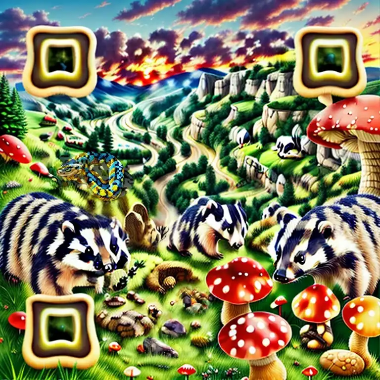
This is extremely effective, but if testing multiple URLs or error correction levels, having to manually create masks each time to accommodate the shifting positions of the finder patterns will get annoying fast. That frustration had motivated me to create my own custom node (ComfyUI is very conducive to customization) so that I could create them automatically and precisely.
Strategy 3 — Mask the conditioning layer for slightly better color control:
The information stored in QR codes consists of binary ones and zeros, which standard QR readers extract by first converting the image to grayscale and then aggregating the pixels that make up a module before assigning them a value.
However, the accuracy with which this can be done is affected by practical real-life variables such as monitor calibration, printer quality, and differing decoding methodologies among readers. It is not enough to have a QR code that you can simply scan by holding up a single app to your computer screen; if you want others to use it, you will need to make it robust.
An obvious choice then becomes ensuring that the images have a strong contrast where the darks are dark and the lights are light. If you look at a simple PNG, the color of each pixel is encoded with three numbers representing red, green, and blue with higher numbers indicating increased brightness in that color channel. A simple approach would be to take the average of them, but there are also more advanced conversions that account for human perception.
To help direct the diffusion model away from low-contrast choices before the image is even generated, there are a few nodes within ComfyUI that can be used to modify your prompt and apply different guidance across both light and dark areas.
- Convert Image to Mask — This can be applied directly on a standard QR code using any color channel. The black (parts of the mask that will be invisible) and white (parts of the mask that will be visible) colors are already ideal for use.
- InvertMask — Apply this to create a variation that selects the black colors of the QR code.
- Conditioning (Set Mask) — Can restrict a prompt to only cover areas that are defined by a mask.
- Conditioning (Combine) — After applying opposite masks to the two variations in the prompt, this will consolidate them into a single input.
- Conditioning (Concat) — Use this to append an additional prompt that will be common to both the light and dark areas of the entire QR code.
On its own, this strategy will be far from perfect. It is practically guaranteed that the the intertwined sections will shift around at great cost to precision once all of the diffusion steps have completed to form an ordered image. But even small pushes in the right direction can be worth the trouble when enough are added together.
Strategy 4 — Target the errors:
The trade-off between creativity and scannability can be one of the most frustrating things about QR code generation.
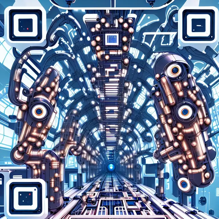
As you iterate through different random seeds (with a control net weight set too low to favor better looking images), there’s nothing worse than seeing something that matches your vision better than anything else, only to have it not scan at all. Regenerating the same seed or running img2img with a stronger weight is a possible solution, but it is very hard to prevent erosion of the very features that captured interest in the first place.
Inpainting could be more precise, but under ordinary conditions there’s no way of knowing if what you’re inpainting is improving the chances of a successful scan. Attempting to overlay the original QR and analyzing differences in brightness can work well, but it’s an inefficient process. To make matters worse, QR readers will only inform you whether a code reads or not, without providing information about how close it was to being read or how much extra margin of error exists.
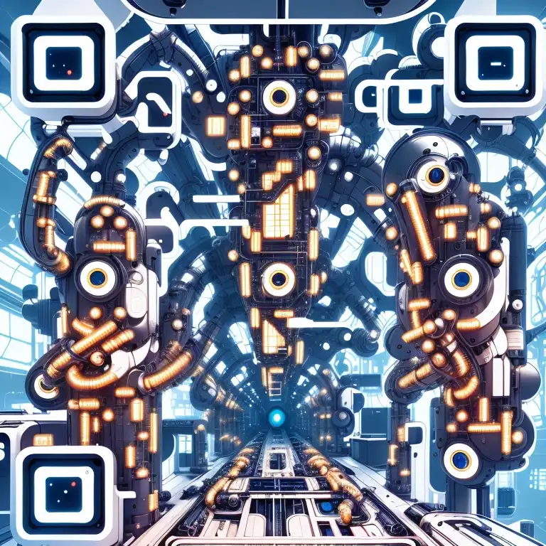
Thanks to the developer friendliness of ComfyUI, I was able to code up a custom node that addresses all of this uncertainty in less than 250 lines of code. The basic idea is to replicate the fundamental processes required to convert a QR code to binary data in ideal conditions and compare the source modules versus the predicted derivative modules.
To put it more simply, the process involves:
- Cropping both QR codes using the predictable placement of the finder patterns from the source QR.
- Converting the color information to grayscale.
- Aggregating all of the greyscale pixels within each QR module to a single value for each.
- Using a threshold of .5 (+/- a configurable sensitivity), assigning values of zero or one (or neither for ambiguous amounts) to each module.
- Comparing the source and the derivative for mismatches.
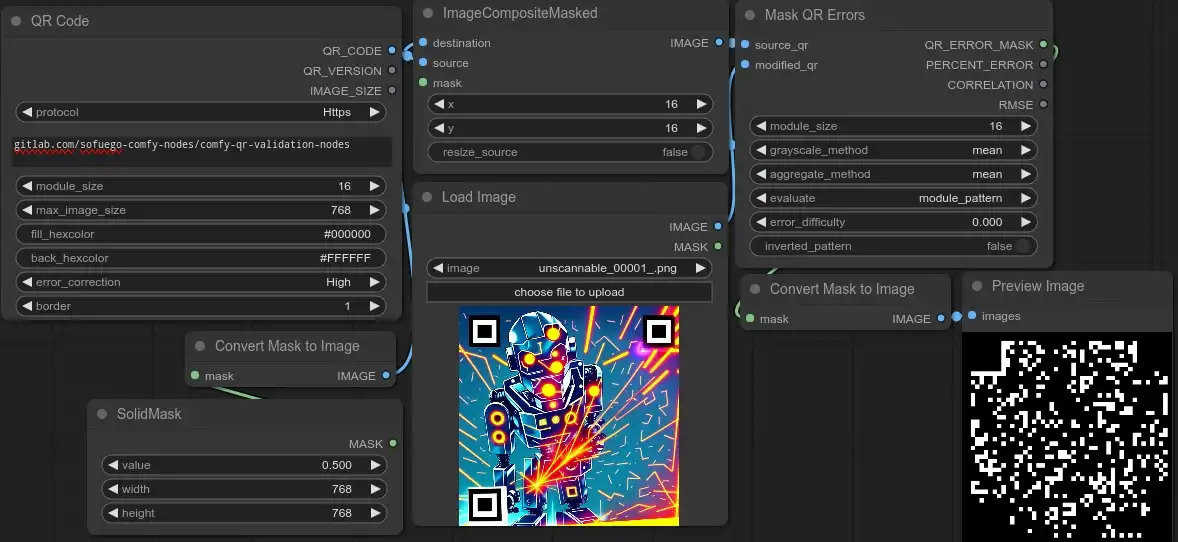
With this information, not only can you get an adjustable value to roughly quantify the amount of error, but you can also automatically generate a mask over just the areas that had the greatest degree of mismatch and less destructively inpaint the way to a readable code. Furthermore, it’s easy to implement other measurements which can assist in comparing for readability improvements (in the case of this particular implementation, Pearson’s Correlation Coefficient and Root Mean Squared Error).
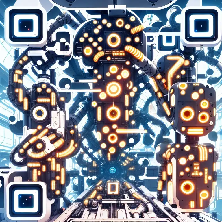
Iterative Error Correction Tip 1
One important note is to be mindful of lossy operations during the inpainting process. Every time Stable diffusion does a round of encoding/decoding from latent to image with the VAE, the entire image will be changed/degraded unless the resulting images are carefully masked and merged with the original.
Even better would be to avoid those conversions altogether by using ComfyUI’s “LoadLatent” and “SaveLatent” nodes. Multiple latents can also be masked and merged for non-workflow-breaking composites with the “LatentCompositeMasked” node.
Iterative Error Correction Tip 2
When trying to get a render to initially scan, testing the finder patterns first is highly recommended. It is very easy to fall into the trap of iterating through rounds and rounds of edits only to have unreadable finder patterns ruin everything. The easiest way to do this is to mask them out and test them superimposed on the original QR code.
Strategy 5 — Increase contrast with color correction
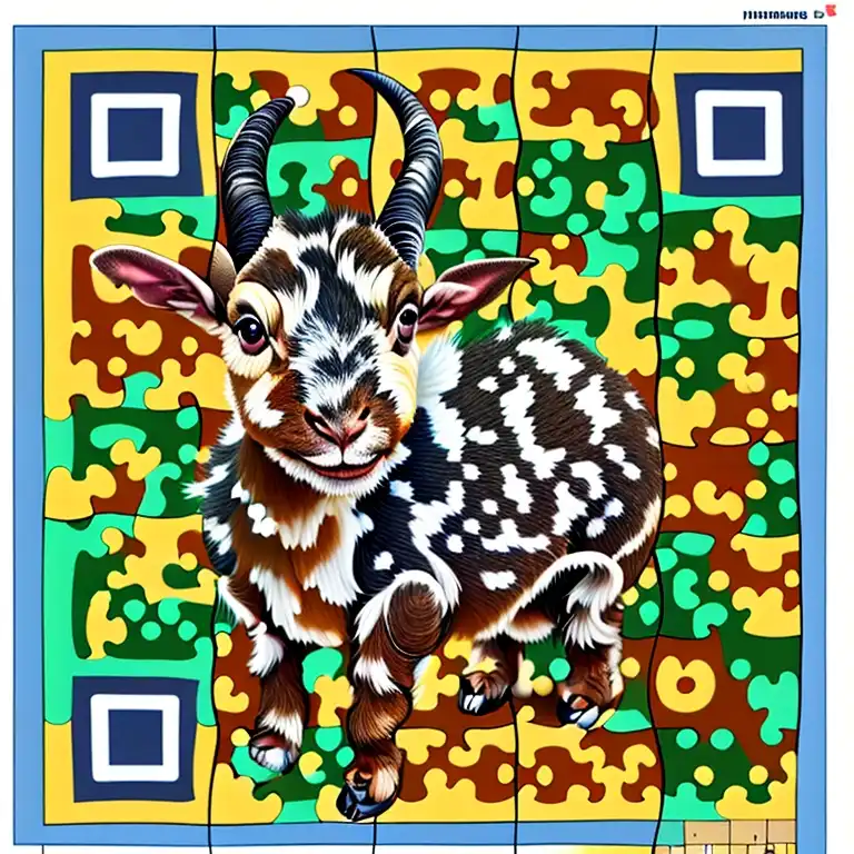
If there is no desire to make further changes to the composition, but the image would benefit from better consistency in scanning, a small color correction can go a long way. If the colors are not too blended, adjusting isolated hues will be very powerful, but scannability boosts can also be achieved by manually brightening and darkening certain areas with a feathered mask or even by slightly increasing the overall contrast of the image.
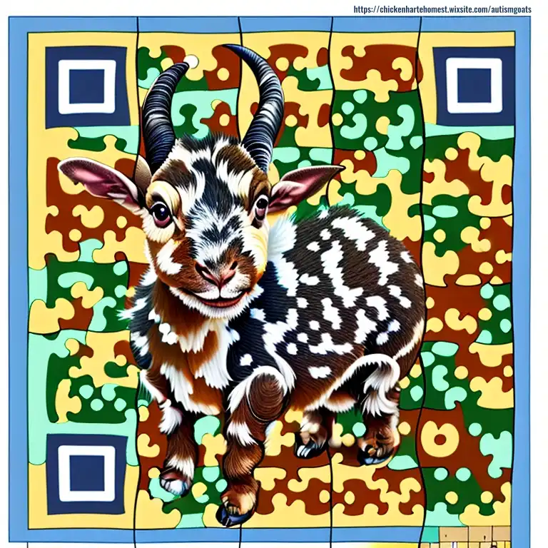
Applying ControlNet to QR codes is still a very novel concept and as time goes on, the process will continue to improve. To make it easier right now, I have also shared a few basic custom workflows for a few techniques in both json and png format which should help you get well on your way to implementing the ideas presented here.